Category: Archive

  • Community messaging – WhatsApp – 2024

    WhatsApp Project
    The Challenge

    Transform WhatsApp from a 1:1 messaging app into a place for meaningful community building. It must keep privacy, simplicity, and reliability across 120+ countries.

    Users were already creating workarounds to connect with real-world networks, but it was messy and hard to navigate.

    People wanted to use WhatsApp for groups and communities, but the app wasn’t built for it. Messages got overwhelming, finding groups was impossible, and navigation was a mess.

    My role

    Led a team through a journey to achieve product-market fit. Inherited an initial MVP and guided two designers through phases 2 and 3 of the transformation.

    Part I: Users didn’t get it

    Users understood structure but not the value proposition.

    Solution 1: Better announcements

    Transformed announcements from one way messaging to a hybrid post format, adding reactions and threaded responses while preserving privacy

    Impact: We delivered broadcast-bubbles and replies. These features distinguished the broadcast space. UXR validation showed improved comprehension between announcements and regular chats.

    Solution 2: Navigation to provide clarity

    Radical navigation redesign creating explicit “community spaces” with clear group relationships

    Impact: Increased sub-group discovery by 7% and reinforced nested interaction model. AndroidPolice recognized navigation improvements: “navigating communities easier with a new icon.” Research shows significantly improved comprehension for Communities and subgroups.

    Part II: Pivot to member-driven growth

    The problem: Only admins could grow communities. Too many permission restrictions meant growth stalled.

    Solution 1: Let members suggest groups

    Conceptualized distributed ownership model with member-suggested groups, ensuring coherent integration with existing permission framework

    Impact: Established strategic foundation for member-driven growth while maintaining design consistency across community features.

    Solution 2: Open groups by default
    I changed WhatsApp from closed-by-default to open-by-default for communities.

    Impact: Group joins doubled, Added about 500K new people joining communities

    Results

    Scale: 120 million active Communities globally serving organizations from schools to crisis response teams

    Product-market fit: Achieved 19M daily-senders, hitting all our top-line PMF goals. This bent the Communities trajectory from a PMF crisis to exceeding goals. This occurred during a period when “success was not guaranteed.”

    Growth innovation: Shifted from admin-dependent to member-driven growth, enabling sustainable organic

    Speed: Shipped 20+ features during Q3 focus room to exit and turnaround struggling product to PMF.

    Real-world use

    Live at: Download WhatsApp

    Employer: Meta

    Year: 2024

    Role: I led the design team to achieve product-market fit.

  • Connected gym experience – Blink Fitness – 2018

    Connected gym experience – Blink Fitness – 2018

    Turning a 6-week project into a year-long innovation partnership

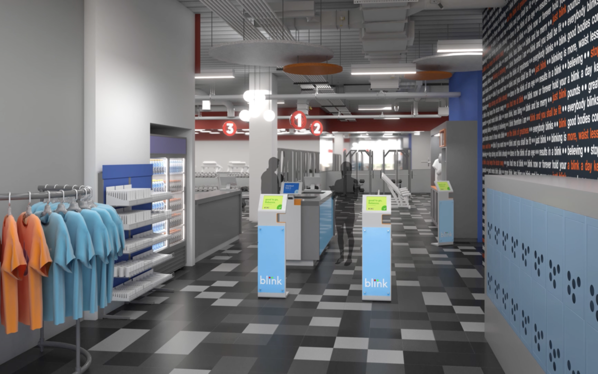
    Blink Fitness hired Fuzz to reimagine their member experience. What started as a 6-week engagement became a year-long collaboration that positioned both companies as leaders in connected fitness.

    Blink needed to differentiate in the crowded budget fitness market and improve operational efficiency at their growing chain of locations.

    My role

    Led experience design strategy and execution. Built Fuzz’s experience design practice while delivering two major innovations for Blink.

    With Blink I accomplished three things for Fuzz:

    • Built the experience design practice into an integral part of the company
    • Position Fuzz as an innovator in the connected experience space 
    • Setup a process for research, design and development to innovate and work effectively.

    Below I share an overview of two key projects I led for Blink  

    Project 1: Activated gym experiences
    Activated experiences features

    The goal: Create connected in-gym experiences that would position Blink as an innovation leader.

    Achievements: 

    • Live working demo in 6 weeks at Fuzz’s model fitness center “Blink Roebling Street”
    • A roadmap that prioritized features by its impact on users, business and tech feasibility. 
    • Launch the first feature at Blink Fitness Grand Central location
    A new Front Desk experience

    The goal was to increase the number of joins. We aimed to improve the experience of members and employees at the entrance. This involved reimagining the front desk interactions. 

    Achievements: 

    • A fully developed demo in 6 months of a new experience in the front desk loved by members and employees. 
    • Working demo performed better in all the established benchmarks
    • Membership sign-up time was 3 minutes faster, checking into the gym took half the time, making a retail purchase was also reduced from 2 minutes to 1 minute. We were able to reduce devices from 20 to 8 with the new ecosystem, and staff did not require any training to use the experience.
    Example of a CTA for a situated interface for an entrance in a retail space.

    We pressure tested our design of a new front desk experience for a major gym chain in our lab environment. This involved running realistic ‘peak-time’ scenarios. Over 40 research participants entered the front desk area to carry out an array of tasks. We identified key operational and customer pain-points through this effort, which we solved in later iterations.

    “I was very impressed that Sandra was able to jump quickly onto the Blink Activated Experiences project and ‘right the ship’ as it were on a project that was very tricky. In general, I am impressed by how she mentors other members of the team and pushes them to do their best as well. She is great to work with, super sharp and super communicative. She’s been an asset on Blink.”

    Product Manager at Fuzz

  • PC Optimum

    A digital experience for Loblaw’s loyalty program in Canada.

    In 2016 Loblaw hired Huge to work alongside them to merge their two loyalty programs: 8M PC Plus and 11M Shoppers Optimum. This effort created Canada’s first unified digital-first loyalty experience. I led UX strategy for the most complex aspects: personalized offers, account merging, and multi-brand integration across Loblaw’s retail ecosystem.

    The design solution

    Unified digital experience: Created a mobile-first architecture. It features simplified redemption mechanics (10,000 points = $10). There is an intelligent personalized offers feed. It includes seamless cross-brand navigation.

    Strategic merger approach: The UX foundation was designed to retain both user bases. It creates intuitive value propositions. These propositions scale across grocery, pharmacy, and retail.

    Complex system integration: We solved the unprecedented challenge. We unified two distinct loyalty ecosystems. This created a cohesive experience for 19 million users.

    Impact and results

    Scale: Designed the largest loyalty program merger in Canadian history unifying 19 million users into a single platform.

    Long-term design system: The design foundation my team created enabled PC Optimum to the following:

    • #1 loyalty program in Canada (38.2% market preference)
    • 17+ million active users (50% of Canadian adults)
    • $1 billion annual redemptions by 2024

    TIMELINE

    VIEW ONLINE

    ROLE

    2016 – 2017

    App Store

    PC Optimum website

    Loblaws

    Led foundational UX design for program merger and launch.

  • TrueBlue relaunch

    Live at: https://trueblue.jetblue.com

    Client: Jetblue

    Year: 2017

    Role: UX Lead (freelance at BigSpaceship)

    Big Spaceship Design Team:
    Heather Harrigan (VP Design)
    Syed Lagoon (UX)
    Jared Bell (Design)

    JetBlue​ requested​ ​Big​ ​Spaceship to​ ​redesign​ ​their​ ​digital​ ​platforms.​ ​I was involved in the ​foundational​ ​ ​UX​ ​and​ ​Design​ ​phase​ ​for​ ​the​ ​redesign​ ​of​ ​the​ ​TrueBlue​ ​ (trueblue.jetblue.com).​ ​

    My role consisted in defining a design-centered agile process to ensure a successful project that followed a user-centered approach.

    Product showcase

    Images with final designs and a quick summary of key features/contributions made to the project.

  • NY.gov

    Government website redesign – New York State – 2014


    The challenge

    New York State’s previous site was a mess, it had not been redesigned in 15 years. Users had to navigate “50 clicks deep” to find basic services, the mobile experience was “virtually impossible,” and critical information was scattered across 150+ disconnected agency websites serving close to 20 million residents.

    New York State's website had not been redesigned since 1999
    New York State’s website had not been redesigned since 1999

    My role

    As lead designer on this project, I worked with Chief Digital Officer Rachel Haot and Governor Cuomo’s digital team to reimagine how government serves citizens online.I led the Code and Theory team on the relaunch of NY.Gov.

    My design approach

    I led a search query analysis of the existing site to identify what people actually searched for when visiting NY.gov. By grouping keywords based on affinity, I defined 24 core reasons why users visited the site, covering more than 70% of all traffic. This data-driven approach made prioritization decisions clear and defensible across the diverse needs of an entire state.

    My definition phase included:

    • User research with diverse New York residents from NYC to upstate communities
    • Stakeholder interviews across multiple state agencies
    • Early usability testing with visual design comps to validate assumptions
    • Data analysis to understand real user behavior patterns

    Information architecture

    I restructured the site’s information architecture, consolidating 16 complex bureaucratic categories into three intuitive sections matching citizen intent:

    • Services – “What can I do?” (Task-oriented government services)
    • News – “What’s happening?” (Emergency alerts, announcements, events)
    • Government – “How does it work?” (Transparency and civic information)

    Other contributions to the IA

    • Universal navigation with contextual agency-specific elements
    • Mobile-first responsive design with full ADA compliance
    • Content guidelines enabling agencies to maintain consistency
    • “One-stop” service cards that could deep-link to any agency site

    Results & impact

    Users nearly tripled (2.3M to 6.0M annually) and page views quadrupled (3.98M to 17.2M annually). Mobile visits surged 277% in the first month.
    The design’s effectiveness was validated during the January 2015 snowstorm when NY.gov became the primary information source for millions seeking emergency information.

    The project received 2015 Webby Awards Honoree recognition and was featured in Government Technology Magazine, Web Designer Depot interview, and Fast Company as a digital transformation success story.

    Final Design

    Long-Term Impact

    The foundational design elements I created in 2014 continue to guide NY.gov more than 10 years later. The three-section navigation structure, mobile-first responsive approach, universal design system remain core to the site’s architecture. These principles enabled subsequent innovations including the New York State Digital Service program, mobile applications ecosystem, and agencies websites and initiatives.

    The Wall Street Journal, New York Unveils Redesigned Website

    Fast Company, Inside NY.gov’s first redesign in 15 years

    Design Week, NY State launches service-led NY.Gov website

    Medium, @RachelHaot: Lessons learned in public digital design

    TIMELINE

    CREDITS 


    DISCIPLINES


    VIEW ONLINE

    2014 – 2015

    In collaboration with Mathieu Mingasson (Creative Strategy), Katherine Robinson (UX), Phil Gordon (Research), Sam Brewster (Production),

    User Experience Design, Strategy, Interface Design and Creative Direction

    ny.gov

    governor.ny.gov

    esd.ny.gov