Author: sandraxi

  • NY.gov

    Government website redesign – New York State – 2014


    The challenge

    New York State’s previous site was a mess, it had not been redesigned in 15 years. Users had to navigate “50 clicks deep” to find basic services, the mobile experience was “virtually impossible,” and critical information was scattered across 150+ disconnected agency websites serving close to 20 million residents.

    New York State's website had not been redesigned since 1999
    New York State’s website had not been redesigned since 1999

    My role

    As lead designer on this project, I worked with Chief Digital Officer Rachel Haot and Governor Cuomo’s digital team to reimagine how government serves citizens online.I led the Code and Theory team on the relaunch of NY.Gov.

    My design approach

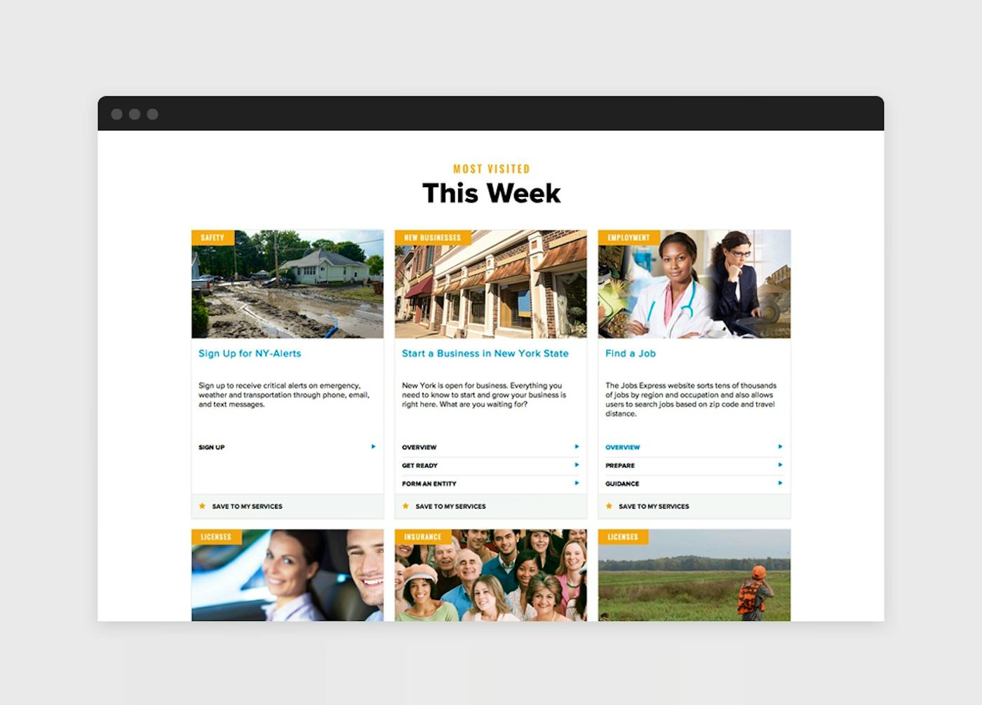
    I led a search query analysis of the existing site to identify what people actually searched for when visiting NY.gov. By grouping keywords based on affinity, I defined 24 core reasons why users visited the site, covering more than 70% of all traffic. This data-driven approach made prioritization decisions clear and defensible across the diverse needs of an entire state.

    My definition phase included:

    • User research with diverse New York residents from NYC to upstate communities
    • Stakeholder interviews across multiple state agencies
    • Early usability testing with visual design comps to validate assumptions
    • Data analysis to understand real user behavior patterns

    Information architecture

    I restructured the site’s information architecture, consolidating 16 complex bureaucratic categories into three intuitive sections matching citizen intent:

    • Services – “What can I do?” (Task-oriented government services)
    • News – “What’s happening?” (Emergency alerts, announcements, events)
    • Government – “How does it work?” (Transparency and civic information)

    Other contributions to the IA

    • Universal navigation with contextual agency-specific elements
    • Mobile-first responsive design with full ADA compliance
    • Content guidelines enabling agencies to maintain consistency
    • “One-stop” service cards that could deep-link to any agency site

    Results & impact

    Users nearly tripled (2.3M to 6.0M annually) and page views quadrupled (3.98M to 17.2M annually). Mobile visits surged 277% in the first month.
    The design’s effectiveness was validated during the January 2015 snowstorm when NY.gov became the primary information source for millions seeking emergency information.

    The project received 2015 Webby Awards Honoree recognition and was featured in Government Technology Magazine, Web Designer Depot interview, and Fast Company as a digital transformation success story.

    Final Design

    Long-Term Impact

    The foundational design elements I created in 2014 continue to guide NY.gov more than 10 years later. The three-section navigation structure, mobile-first responsive approach, universal design system remain core to the site’s architecture. These principles enabled subsequent innovations including the New York State Digital Service program, mobile applications ecosystem, and agencies websites and initiatives.

    The Wall Street Journal, New York Unveils Redesigned Website

    Fast Company, Inside NY.gov’s first redesign in 15 years

    Design Week, NY State launches service-led NY.Gov website

    Medium, @RachelHaot: Lessons learned in public digital design

    TIMELINE

    CREDITS 


    DISCIPLINES


    VIEW ONLINE

    2014 – 2015

    In collaboration with Mathieu Mingasson (Creative Strategy), Katherine Robinson (UX), Phil Gordon (Research), Sam Brewster (Production),

    User Experience Design, Strategy, Interface Design and Creative Direction

    ny.gov

    governor.ny.gov

    esd.ny.gov

  • The Globe and Mail

    The Globe and Mail

    How people read their news has changed. The Globe and Mail and Code and Theory worked together to redefine how they transform the digital delivery of news.

    We prepared a comprehensive digital strategy for the Globe and Mail. Then focused on relaunching their iPhone and iPad app to test the proposed digital strategy.

    The ios apps set the agenda for further developments in The Globe and Mail ecosystem.

    See the app

    Pulling only the most important or relevant personalized content from the Globe and Mail into the app

    Designing for a changing news cycle

    Stories need different levels of crafting and customization. Wanted to provide editors with content packages, rich-media modules that will offer enough flexibility for accommodating peaks and lows in traffic, day parting, variations in rhythm and density and shifts in user behaviors.

    My role

    UX and Interaction design lead for their iPhone and iPad Native App. See the app

  • The Wall Street Journal

    The Wall Street Journal (WSJ) is recognized today as a publisher with a strict paywall and a leader in the subscription revenue model. In order to achieve this, WSJ realized they needed to do more than simply offer content; they needed to position themselves as a service. Since then it has invested in building an in-house development and design divisions collaborating in different teams working closely with editorial and executives. WSJ is focused on building personalized tools for their customers while improving their editorial storytelling capabilities to provide powerful services for paying customers and impactful journalism for everyone.

    I worked with WSJ on key projects to help realize this vision. The projects I led focused on three themes:

    • User Research: Establishing an on-going system to inform WSJ about how people use their site.
    • Personalization Tools: Strategizing and designing personalized subscriber-only products.
    • Editorial Capabilities: Defining products like “5 things” and an event-centric responsive template perfect for fast-paced events like the Olympics and the World Cup. Our goal was to improve the way that the editorial team tells stories and publishes special event coverage online.

    User Research

    WSJ went through a major redesign in 2007 led by a consulting firm. The consulting firm took several months for user research and to define personas, a research tool to help build empathy towards the visitors to websites. It was a lengthy, painful process that left internal teams with biases against the user experience (UX) design process. By the end, “User research” and “personas” had become forbidden words in strategy meetings.

    The Director of UX brought me on board with the goal of changing the team’s perception. With her support I introduced two projects: User Fridays, a concept to which I was introduced at the Agile UX Conference, and Proto-personas.

    During User Fridays, users would visit the offices of the Wall Street Journal, where we offered them lunch and interviewed them for about an hour. The goal was to introduce the concept of research as a low-effort and valuable resource for each product development team. What started with friends and family as participants then moved to subscribers and pretty soon I was struggling to schedule all the requests from other teams that wanted to participate in the User Friday Session. When this happened I created a kit for every team to be able to organize their own User Friday sessions.

    During a brainstorming meeting we found ourselves struggling to find language to talk about our users. That is when I brought in Jeff proto-personas workshop to help facilitate and change the perception of WSJ website users from individuals to personas. Soon enough, proto-personas went from a dirty word to a helpful concept that was integral to many brainstorming meetings.

    Results:

    • More than 30 User Fridays were organized.
    • User Fridays Research Kits were used for teams including Factiva, Barron’s and MarketWatch.
    • A brainstorm kit was developed that included proto-personas workshop.

    Personalization Tools

    As part of the development team, User Experience got unique opportunities to define personalized products for WSJ subscribers. I led three projects:

    My News

    A news reader that gives you the latest news tailored to you based on companies in your portfolio and on your watch list

    Profile

    A home for conversations among those in the financial industry adding a social layer to the WSJ reader community

    Results:

    • Briefcase and Profile were featured as key reasons to invest in Newscorp (see the press release and Los Angeles Times article).
    • My News became a major tool for WSJ’s subscribers specially among amateur investors. Due to its popularity, My News was re-skinned and repurposed for Barrons and Marketwatch.

    Editorial Capabilities

    WSJ invested in services for subscribers, but they also needed a strategy to reach new audiences and promote their open-access content. A trend of creating long-form journalistic content was starting but the content management system and product team took many hours to develop and design these stories and the editorial workflow was painful. Under the leadership of Erin Sparling and Tracy Corrigan, we formed a four-person editorial capabilities team tasked with building tools for editors.

    Results:

    • Created a responsive template for long-term events used for The Winter Olympics and the World Cup coverage.
    • Developed a template for snackable content also known as “5 things” that is used for about ten stories per day. We took one month to develop this crucial template, compared to the 7 months it would’ve taken the product team.
    • Developed a navigation system for long-form stories used by more than twenty articles.